
How I Restructured a Cheshire East WordPress Website and What Happened Six Months Later
A Cheshire East organisation had an existing WordPress site that was hard to navigate and maintain. Here is how I restructured it and what the search data showed six months on.
This was not a blank-slate build. A Cheshire East organisation already had a WordPress website, and it already had a lot of content. The problem was not that the site existed. The problem was that it had grown faster than its structure could cope with.
The brief was to bring several different content types together into one website that people could actually navigate: core information, a large set of individual profiles, pages for local areas, and an ongoing stream of news and updates. It also had to stay maintainable once I handed it back, so the organisation could keep it running without needing a developer every time it added a page.
I delivered the work between 5 February and 13 March 2026. Several months after launch, I reviewed the site again using its search-performance data to see what had happened. This case study covers both the restructuring and that follow-up.
One idea sits underneath the whole project, and it is worth stating up front: you might not need a completely new website. You need to understand what is stopping your current one from working better.
The Problem With the Existing Website
Before touching the layout, it helps to understand why the site needed restructuring at all. A redesign that skips this step usually just moves the mess around.
A Website That Needed to Serve Cheshire East
The site had to do several jobs at once. It carried information about local areas across Cheshire East, a large collection of individual profiles, core pages explaining who the organisation is and what it does, and a running feed of news and updates.
Each of those content types attracts a different visitor with a different question. Someone looking for their local area wants something different from someone reading the latest news, and both want something different from someone checking a specific profile. When all of that content shares one flat structure, every visitor has to work harder than they should to find the one thing they came for.
The core challenge, then, was organising these content types so that each visitor journey had a clear path through the site rather than a pile of pages to sift through.
Working Within an Existing WordPress Platform
This mattered a great deal to how the project ran. The WordPress platform already existed, and it came with its own theme and its own conventions. Some functionality I could change directly. Some of it was controlled centrally by the platform and theme, which meant certain behaviours could not simply be overwritten.
Against that backdrop, the specific problems were:
- a growing number of individual profiles that had outpaced the original structure
- multiple geographical areas that needed a consistent home
- inconsistent presentation from one section to the next
- navigation that needed rethinking rather than tweaking
- platform and theme restrictions that limited some changes
- a need for the result to stay maintainable long after launch
There is a principle worth holding on to here. A website should not become dependent on its original developer just to keep ordinary content organised. If adding a profile or a local-area page requires a specialist every time, the structure has failed, no matter how good it looks.
How I Restructured the Website
With the problems understood, the work became a question of structure first and presentation second.
Building the Information Architecture
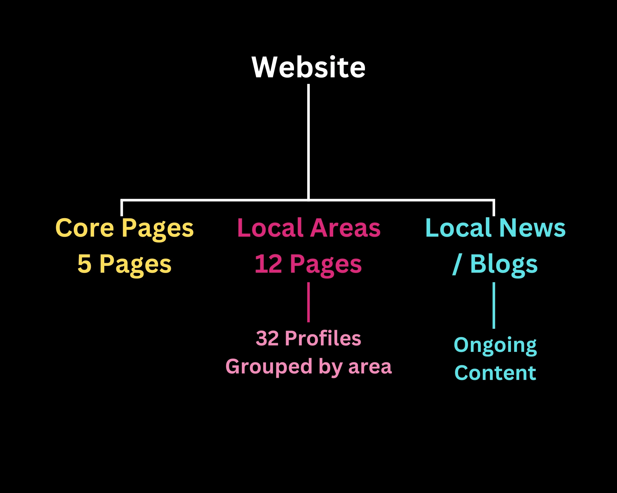
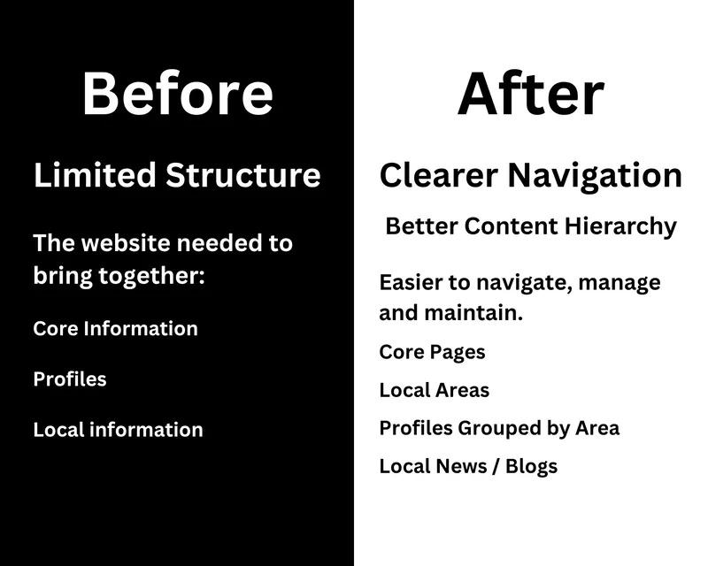
The starting point was mapping the relationships between the different content types rather than the pages themselves. Local areas needed to connect to the profiles that belonged to them. Core pages needed to sit apart as the fixed, permanent information. Local news and ongoing content needed a home that could keep growing without disturbing everything else. Navigation then had to reflect those relationships so the structure was visible to visitors, not just to me.
Once those relationships were clear, the individual pages had an obvious place to live, and so did any page added later.
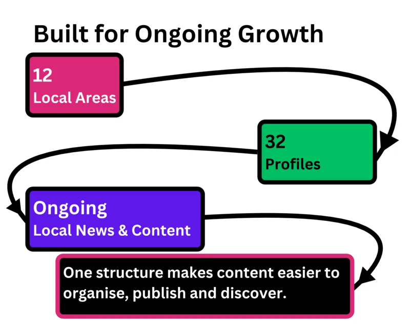
12 Local-Area Pages
Twelve local-area pages gave the site a predictable geographical backbone. Each area page acts as a landing point for the profiles connected to that area, which means a visitor can start from a place and work inward, rather than scanning one long undifferentiated list. Structurally, these pages are what let the profiles be grouped in a way that makes sense to a first-time visitor.
32 Individual Profiles
The 32 individual profiles were the part of the site that had grown the most and suffered the most from inconsistency. I gave them a consistent, reusable layout so that every profile presented its information in the same order and the same way. The payoff is threefold: visitors get predictable presentation and know where to look, navigation between profiles becomes easier, and the organisation can add or edit a profile later without reinventing the layout each time.
Improving the User Experience
Structure fixes where things live. User experience fixes what it feels like to use them. I worked through the areas that most affected how the site felt in use, and in each case the test was the same: what does this change do for the person using the page?
- Navigation. Reorganised so the main sections reflect the real structure, which means fewer dead ends and less guessing.
- Readability. Cleaner content hierarchy so headings and text guide the eye instead of competing for it.
- Profile cards. Consistent cards so a visitor can scan and compare profiles at a glance.
- Homepage elements. Clearer entry points into the main sections so people can start their journey quickly.
- Imagery. Optimised images that support the content without slowing the page down.
- Contact functionality. A clear route to get in touch, so an interested visitor is not left hunting for it.
- Mobile experience. Layouts that hold together on a phone, where a large share of visitors actually are.
Adding Custom Functionality Without Rebuilding Everything
Not every requirement could be met by rearranging existing parts. One example was a custom HTML slideshow, which I built to fit inside the existing WordPress content system rather than bolting on a heavyweight plugin or replacing the platform. It behaved responsively across screen sizes and used optimised imagery so it did not undo the performance work elsewhere.
The aim wasn't to replace the platform. It was to make better use of what was already there.
When the Website Started Throwing Server Errors
Partway through the project the site began returning server errors, specifically 502 and 520 responses. This is the part of a project where it is tempting to guess, so I treated it as a diagnosis problem rather than a fixing problem.
Diagnosing 502 and 520 Errors
The first job was to reproduce the errors reliably, because an intermittent fault you cannot trigger on demand is very hard to fix with any confidence. Once I could reproduce them, I investigated the conditions around them and tested across different environments and devices to see where they did and did not appear. I am not going to claim a single definitive root cause beyond what the work documented, because that would be guessing dressed up as certainty. What I can say is that the errors were reproduced, investigated and tested rather than patched blindly.
Testing the Fix
Once changes were in place, I ran a documented round of quality assurance across the parts of the site most likely to be affected:
- front-end pages
- profile pages
- archive pages
- the WordPress administration area
- custom fields
I ran that testing across desktop, tablet and mobile, using a MacBook Pro, an Android phone and an iPad. No further 502 or 520 errors were encountered during that documented QA. That is an honest statement of what the testing showed. It is not a promise that a server can never error again in future, because no one can promise that.
Preparing the Website for Google
Search work was part of the project, but it was a proportionate part. This is a website-development case study, not an SEO case study, and it would be misleading to present it as one.
Search Engine Optimisation Before Launch
Where it applied, the pre-launch search work included page titles, meta descriptions, internal linking, sitemap checks and configuration, image alt text and the appropriate Yoast SEO fields within WordPress. These are the practical, unglamorous tasks that make a site legible to search engines.
An important point about credit. The substantive written content on the website came from the organisation's own staff and contributors. My role was structural and technical, not authorial. It would be wrong to imply that I wrote the site's content, and equally wrong to imply that search configuration on its own produced the visibility that came later.
The Starting Point
At launch the picture was simple. The homepage was appearing in search, and the other pages had yet to be indexed. That is a normal starting position for a restructured site, and it is worth recording plainly because it becomes the baseline for the follow-up later on. Nothing dramatic, just a clear place to measure from.
Delivering the Project 32% Faster Than Estimated
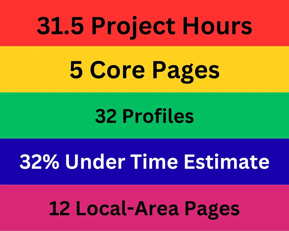
46 Hours Estimated. 31.5 Hours Delivered.
The project was estimated at 46 hours. The tracked work came in at 31.5 hours, roughly 32% under the estimate. The 31.5-hour figure comes from project work logs where time was recorded in hour blocks, so it is a record of work done rather than a rounded guess.
That efficiency did not come from rushing. It came from a handful of deliberate choices:
- A clear scope, so effort went into agreed work rather than drift.
- Reusable content structures, so the profile and area layouts were built once and applied many times.
- Batching related work, so similar tasks were done together instead of context-switching.
- Structured workflows, so each stage fed the next.
- Sensible escalation of platform limitations, so time was not burned fighting things the platform controlled centrally.
- Avoiding unnecessary redevelopment, so nothing was rebuilt that did not need rebuilding.
The lesson here is about efficient delivery, not about cutting corners. Those are not the same thing.
What Happened Six Months Later?
Launch is a milestone, not an ending. Several months after the site went live I looked at its search-performance data to see how it had behaved in the wild. This is the analytical heart of the case study.
Looking at Search Console
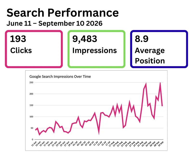
The period I analysed runs from 11 June 2026 to 10 September 2026, a three-month window several months after launch. Being specific about the window matters, because a figure without a timeframe is not really a figure at all. The headline numbers from that window are shown in the search-performance summary at the top of this case study.
Search Visibility After Launch
Over that window the site recorded:
- 193 clicks
- 9,483 impressions
- 8.9 average position
For a site whose non-homepage pages had only just started being indexed at launch, seeing the pages picked up and surfacing in search across a three-month window is a healthy sign that the structure is legible to search engines.
What the Data Does and Doesn't Tell Us
This section is deliberate, because it is where case studies most often overreach. The data shows what happened after the website was restructured, but it does not allow every change in search visibility to be attributed solely to the redesign.
Several factors sit alongside the restructuring and could each have influenced these numbers:
- underlying search demand, which rises and falls on its own
- external events that drive people to search
- new content added after launch
- contributions from the organisation's staff
- Google's own indexing timelines
- ranking changes across search results generally
- other external factors outside anyone's control
So the honest reading is this: the restructuring gave the site a sound foundation to be found and used, and the data shows the site being found and used. It does not prove the redesign single-handedly caused every increase, and I am not going to claim it did.
What This Project Showed Me
A few things stood out by the end:
- Good structure makes a larger website easier to navigate.
- That same structure makes it easier to maintain afterwards.
- Existing platforms do not always need replacing.
- Technical problems need diagnosing before they are fixed.
- Launch is not the end of the project.
- Search data becomes far more useful when there is a baseline to compare against.
- Efficient delivery does not mean cutting corners.
- Content architecture should be built to accommodate future growth.
Not Sure Whether Your Website Needs Rebuilding?
You might not need a completely new website. You need to understand what's stopping your current one from working better.
A lot of the time, the symptoms that make people reach for a rebuild are structural rather than terminal:
- confusing navigation
- inconsistent page layouts
- a poor mobile experience
- slow performance
- content that is difficult to manage
- a weak content hierarchy
- user journeys that do not lead anywhere useful
Where those are the issues, the right answer is often optimisation, restructuring, consultancy, UX and layout improvements, or performance work, rather than starting again from scratch. That said, some websites genuinely do benefit from a redesign because the existing foundation is unsuitable. The point is not to assume which one applies before actually looking at the site.